Product development is becoming increasingly demanding. Quality requirements are rising; additionally, designers need to consider criteria such as sustainability and energy efficiency. Visualization software offers the potential to reveal the complex interaction between all the different parameters and features of the planned product. For this purpose, Fraunhofer researchers have developed an interactive tool that provides a reliable basis for making informed decisions about the design alternatives of a product.
Data visualization has turned into a megatrend. It is about more than just using visual representations to illustrate numbers – the visualization provides an overview, highlights structures and reveals correlations. Given the exponential growth of data quantities in all sectors – whether business, industry, retail or transport – the flood of data can no longer be controlled without visualization.
The Fraunhofer Institute for Computer Graphics Research IGD in Darmstadt has developed a particularly promising visualization application. Its main focus is on product design, i.e. the development of products in which all of the variable characteristics or performance indicators are calculated and balanced. Together with the Linz Center of Mechatronics (LCM) in Austria, the Fraunhofer researchers applied this project specifically to the development of electric motors. The research partner from Linz generated the technical data and, based on this, executed the mathematical simulation of all product parameters.
All product parameters in a single interactive visualization
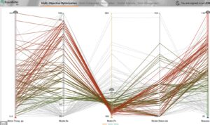
The visual representation created by the Fraunhofer software covers all criteria that are relevant for the development of the motor, this includes: size, weight, engine power, torque, consumption, costs, efficiency and temperature. Typically, up to ten different criteria are observed at the same time.
The visualization depicts the interactions of individual parameters in the form of exact curve charts and, in particular, communicate what happens when one value is changed. Changing a value often leads to conflicts of interest. If, for instance, the desired engine power is increased, costs increase as well, to name just one example.
The visualization is by no means static. The developer can change the value of each parameter continuously by moving a slider, thereby eliminating undesired values, such as excessive costs. The software displays how this affects the other criteria in real time. In this way, it is possible to run through what-if scenarios for the different design alternatives.
While this may seem trivial at first glance, the interaction of the parameters is highly complex. “Including nine or ten parameters quickly results in several hundred different design alternatives,” explains Lena Cibulski from Fraunhofer IGD. She works in the institute’s Information Visualization and Visual Analytics department and leads this project.
The visualization not only supports developers and engineers during their daily work, it can also be of great help during presentations to the company’s customers or members of management. They can see the available options at one glance and explore all of the possible design alternatives in an easily understandable way. “There is no single best solution,” says Cibulski. There are only a number of available options, each with different characteristics and performance indicators that the responsible decision-makers need to trade off. This results in a product with features and performance characteristics that are carefully balanced and represent the best possible compromise.
The visualization software offers two additional features to make the decision process even more transparent. Shortlisted design alternatives can be marked as favorites and highlighted with a specific color. They will always remain visible in the visualization. In addition, the developers can specify limits for the individual properties. This ensures that the product meets the required specifications, for example with regard to consumption or performance.
Visualization reveals hidden relationships

The tool is not meant to replace the expertise of an experienced engineer. Instead, it helps them utilize their knowledge and experience as efficiently as possible. For example, they could use the software to try out unconventional ideas directly on the screen. “It often comes down to nuances. A small change in a certain value, even if it is only the wall thickness of the material at a certain location, can have unpredictable effects on other parameters,” explains Cibulski. As such, the visualization tool also makes hidden relationships visible. Furthermore, on-screen simulations help eliminate design errors and minimize risks.
The software is web-based. The customer or business partner only needs to click on a link to launch the software and can then compare and evaluate all of the alternatives themselves – dramatically speeding up communication and coordination processes. However, the software can also be installed locally on a computer, if required.
The software application developed by Cibulski and her team at Fraunhofer IGD is not dependent on the simulation model provided by the Linz Center of Mechatronics. In principle, any simulation model can be used for visualization. The selected model determines the options to be compared and calculates their values for the desired product parameters. The resulting solution candidates can then be imported into the Fraunhofer application and compared with each other.
Applications in many industry sectors
This enables the Fraunhofer researchers to offer their visualization software for various industry sectors. In the case of electric motors, the software is suitable both for the development of new motors and for the further development and optimization of existing products. “The software is an ideal choice whenever dealing with many design options and a number of incompatible quality criteria that require a compromise to be made,” explains Cibulski. Examples include decisions involved in considerations about energy supply concepts for a building or in the development of complex production systems in a factory.
Product development has become much more complex in recent years. As an example, aspects such as sustainability and energy efficiency have been included as additional targets as a result of the climate debate. This complexity makes visualization even more important because it creates a transparent and reliable basis for all decisions. As such, visualization is an important part of the workflow and helps accelerate the entire product development process.


